We took our own name and designed it six completely different ways. Typography, color, and positioning decide who buys, who you sponsor, and what your ads cost. We build all of it, from the brand kit to the ad account, for product brands anywhere in the United States.
Concept work, our own brandSame name. Six different companies.
01 · The range
What do six different brand directions actually look like?
Six brand directions look like six different companies, even when the product and the name are identical. Every concept below is the same brand, ours, pointed at a different buyer. Read the typography and the palette first, then the audience, then the playbook that follows. Nothing downstream is arbitrary: the sponsorship strategy, the influencer mix, the price point, and the ad creative all fall out of the positioning choice.
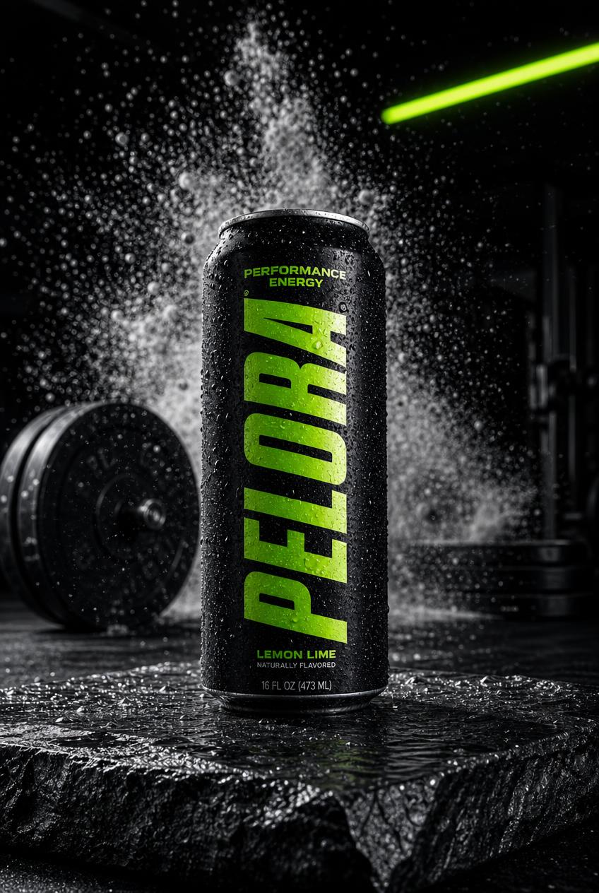
Athlete Performance
Condensed uppercase, black + electric lime
Competitive men 18 to 40. Gyms, fight sports, motocross.
The playbook: Sponsor fighters and CrossFit athletes. UGC from training footage. Ads lead with intensity and proof of output.
Clinical Science
Thin sans-serif, white + silver, one green accent
Research-first buyers who read the label before the headline.
The playbook: No hype influencers. Doctors, PhDs, longevity podcasts. Ads lead with ingredients, dosages, and citations.
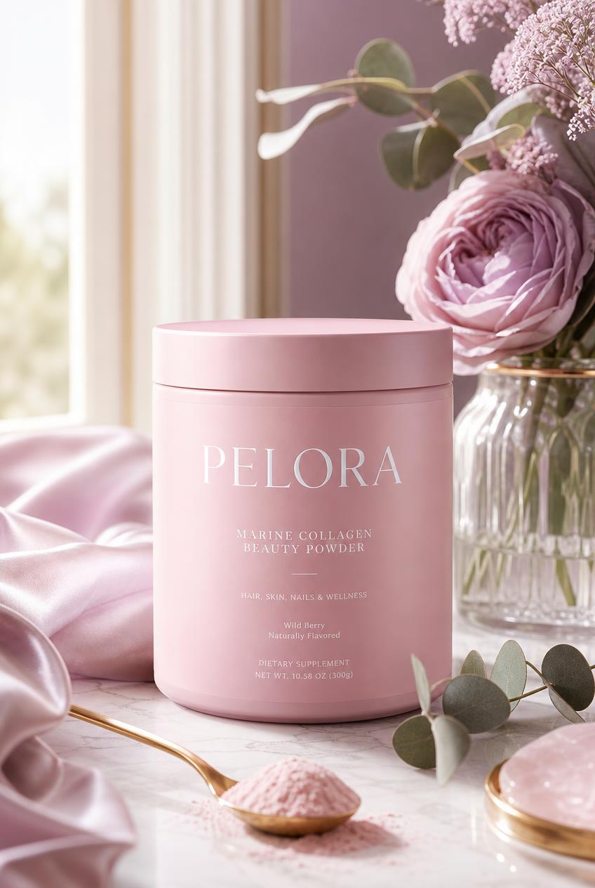
Feminine Wellness
High-contrast serif, blush + lavender + cream
Women 25 to 45, beauty-from-within, morning-ritual buyers.
The playbook: Moms and wellness creators, pilates and skincare crossovers. Ads lead with ritual, texture, and self-care.
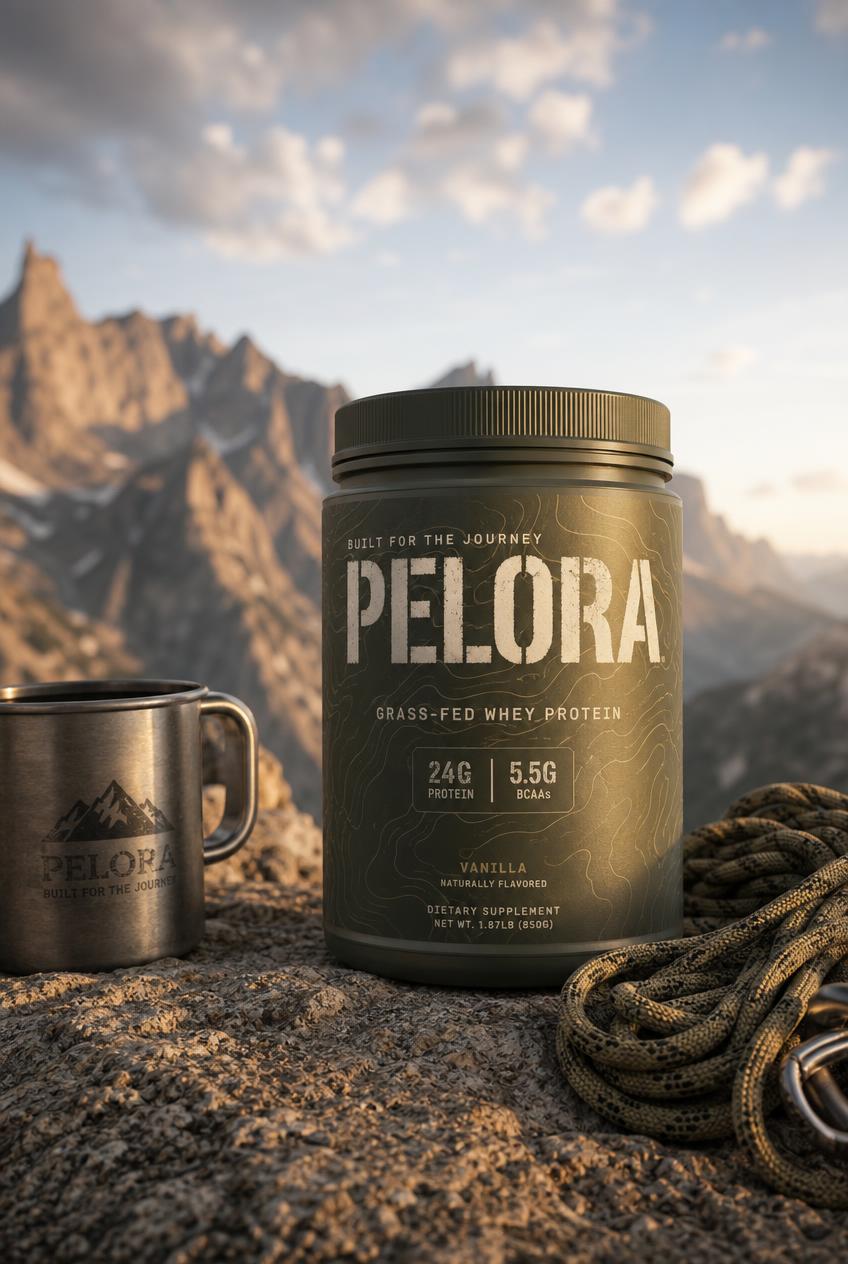
Rugged Outdoor
Stencil type, olive + tan + charcoal, topographic detail
The playbook: Trail athletes and outdoor YouTubers. Ads lead with environment and endurance, never the studio.
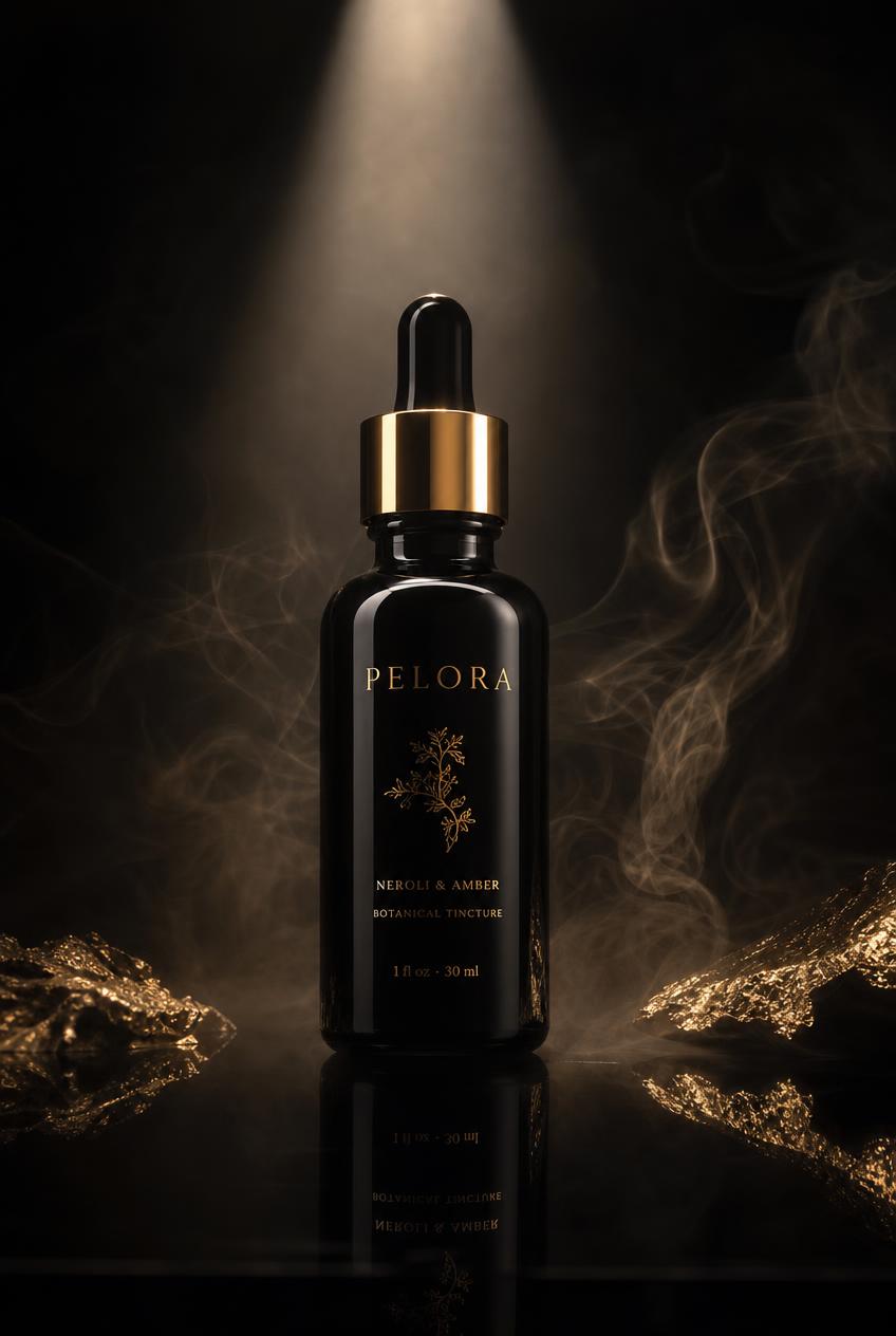
Ultra Premium
Thin gold serif, black glass, gold foil
High earners where the price is part of the proof.
The playbook: No sponsorships at all. Exclusivity is the strategy. Partnerships with concierge medicine and private clubs.
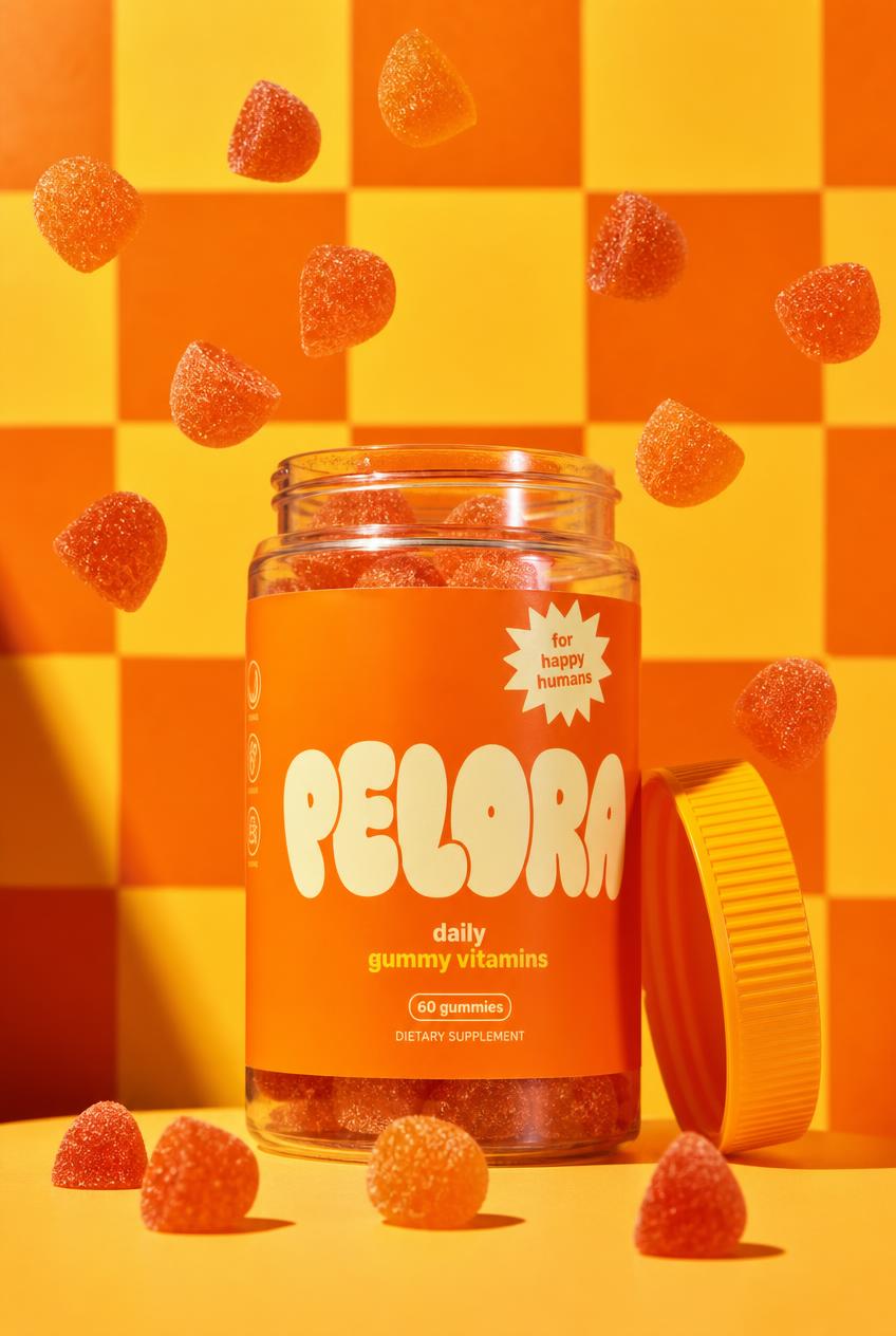
Playful Gen Z
Chunky bubble type, tangerine + butter yellow
18 to 28, TikTok-native, buys from the feed not the search bar.
The playbook: Micro-influencers in volume, college ambassadors, meme-literate creative. Ads feel like content, not ads.
Why our own brand and not client logos
All six concepts use PELORA, our own name, on purpose. We do not decorate a portfolio with client trademarks or invent case studies. Real client work on this site is labeled real and named. Concept work is labeled concept. This is how we show range without borrowing anyone's brand to do it.
02 · The decision
How does a product brand choose its direction?
A product brand chooses its direction by deciding who the customer is before deciding what anything looks like. The brand kit, typography, palette, packaging finish, is the visible output of that decision, not the starting point. The test we run with founders is simple: name the one buyer you would build the whole company around, then check whether every visible choice would make that specific person feel the product is for them.
The expensive mistake is the middle. A brand that is a little bit performance, a little bit clinical, and a little bit fun reads as nothing to everyone, and pays for it in the ad account: weaker click-through, higher acquisition costs, and creative that never finds an audience it belongs to. Committing to one direction feels like narrowing the market. It is actually how a product earns a market at all.
Sponsorship follows the same logic. Athletes make sense when performance is the story. Doctors and researchers when evidence is the story. Fifty micro-influencers when the feed is the store. And for a true luxury position, the strongest move is often no endorsement at all, because scarcity is the message. Paying for the wrong kind of famous face is one of the fastest ways to spend a launch budget on the wrong signal.
03 · Original research
What do 49 real DTC brands actually do?
We audited the live websites of 49 direct-to-consumer product brands across supplements, beverage, skincare, and fitness apparel, and read what they actually ship: the typefaces declared in their CSS, their color palettes, whether they offer a subscription, whether a price is visible, and how deep their introductory discount goes. 38 were reachable. Every number below comes from public HTML and CSS, collected 2026-08-18.
3%
Use a serif typeface
Exactly 1 of 38 brands leads with serif. 47 percent use a named sans-serif and 45 percent license a custom typeface we could not match to a common family. The category has converged almost completely on sans.
95%
Run a light palette
36 of 38 declare a predominantly light color palette. One brand in the entire sample is dark-led. Whatever "standing out" means in this category, it currently does not mean going dark.
87%
Offer a subscription
33 of 38 sell subscribe-and-save or an equivalent recurring plan. Among supplement brands specifically it is 100 percent. Subscription is no longer a differentiator in this category, it is the entry fee.
The finding we did not expect
22 of 38 brands (58 percent) advertise a percentage-off introductory offer, and the median depth is 25 percent. That median sits almost exactly on the line where the best available third-party retention data says the offer stops paying for itself.
Why the 25 percent default is a problem
Recharge published two analyses in July and August 2026 built on its own subscription network, and both point the same direction. In a cohort of roughly 29.8 million new subscriptions, first-renewal rate declined steadily as the introductory discount deepened: 65.0 percent with no discount, 64.7 percent under 20 percent off, 62.9 percent at 20 to 40 percent, 61.3 percent at 40 to 60 percent, and 53.4 percent past 90 percent off.
The lifetime figure is starker. Measured against each store's own average subscriber over 12 months, shallow discounts of 1 to 10 percent produced subscribers worth $9.58 more than average, while discounts of 25 to 50 percent produced subscribers worth $8.48 less. The category's median offer, 25 percent, lands at the top of that losing band.
Recharge discloses its own limits, and we will repeat them rather than hide them: discount bands are approximate and the underlying discount fields carry upstream matching noise. This is one platform's network, not the whole market. But it is measured data on tens of millions of subscriptions, which is more than the conventional "run a big intro offer" advice has ever been built on.
What this changes in practice
A deep intro discount can still be right when the product genuinely builds a daily habit inside the first cycle, which is the case a few well-known brands have made. What the data says is that this is the exception being sold as the rule. If you are discounting at the category median because everyone else is, you are most likely buying subscribers who are worth less than the ones you would have won at 10 percent off, or at full price with a better offer than a discount.
Where the white space actually is
Put the three convergence findings together and the unoccupied ground is obvious. Serif type appears in 3 percent of this sample. Dark palettes in 3 percent. The luxury and clinical directions in the concepts above deliberately use what almost nobody in this sample uses.
We want to be careful about what that does and does not mean, because the academic evidence cuts both ways. Vecino and colleagues, publishing in PeerJ Computer Science in 2022, ran a live ecommerce prototype with 246 participants and found no usability difference between serif and sans-serif at all, noting that most ecommerce sites use sans-serif and that they could find no evidence supporting the choice. A 2026 study in a Springer volume, using identical hand-cream mockups differing only in typeface, found the serif version was rated more expensive, but that is one product, one market, and 189 participants. A separate study of luxury fashion logotypes found serif complexity did not raise perceived luxury at all.
So the honest claim is narrow: serif is differentiating in this category because it is rare, not because it is proven to perform better. Rarity is a positioning asset on its own. Anyone telling you a typeface reliably lifts conversion is selling past the evidence.
30 of 38 brands (79 percent) show a price on the homepage, so price transparency is close to standard and hiding price now reads as evasive rather than premium. The genuinely differentiated position in this category is not a louder discount. It is a typeface, a palette, and an offer structure that the other 37 brands are not running.
Method, limits, and what we refused to claim
Prior art we are extending. The closest published precedent is Shinahara and colleagues at ICDAR 2019, who ran a font-and-color census across 207,572 book covers and 30,000 advertisement images and correlated style with genre. That work inferred typography from pixels. We read the declared CSS instead, on a different corpus, and join it to commercial signals nobody has joined it to before: subscription availability, discount depth, and price visibility. On the perception side we lean on Henderson, Giese and Cote in the Journal of Marketing (2004) and Labrecque and Milne in the Journal of the Academy of Marketing Science (2012), and we treat Elliot and Maier's 2014 Annual Review of Psychology survey as the guardrail: color effects are real but depend on context and learned meaning, so we make no absolute claims about what a color does.
Sample: 49 DTC consumer product brands we selected across four categories, 38 reachable. 11 returned 403, 429, or a failed connection to an ordinary request and were excluded from every percentage rather than guessed at. Typography is classified from the first named family in each CSS font stack, not the generic fallback, and families we could not identify are reported as custom rather than forced into a bucket. Palette is derived from declared hex colors weighted by frequency, which approximates a brand palette and does not replace looking at the site. We did not measure revenue, conversion, or whether any of these choices caused any outcome. Correlation between a typeface and a business result is not something this method can establish, and we are not claiming it.
04 · The economics
What are the numbers behind a product brand?
Positioning decides the aesthetics. Unit economics decide whether the brand survives. These are the three numbers we build every product engagement around.
LTV
Lifetime value
Everything a customer spends with you over the relationship, not one order. Subscriptions, repeat purchase, and average order value are the levers. Most product brands have more room here than in their ad targeting.
CAC
Customer acquisition cost
What you actually pay to win one customer, all-in. Creative quality moves this number more than bid strategy does, which is why we produce the creative and run the media as one team.
3:1
The ratio that gates growth
Our published guidance: LTV to CAC of 3:1 minimum, 4:1 or better as the target. Under 3:1, scaling the ad budget scales the losses. We tell you which side of the line you are on before we spend.
Under $3K/moAd budget at this level goes to Google Search only. Capture the demand that already exists before paying to create new demand.
$3K to $7.5KAdd Meta brand awareness video. Google still captures intent while Meta starts building the audience that will retarget later.
$7.5K to $15KMultiple campaigns across Google and Meta. Retargeting and lookalikes from your customer data start doing real work.
$15K and upYouTube and TikTok earn a place. Diversified channel mix with the creative volume to feed it.
Motion, made in house
Stills sell the shelf. Motion sells the feed.
Three of the six directions above, moving. Same product, same name, three different companies. This is the format that runs as a paid social ad, and we build it in house alongside the stills.
Athlete PerformanceCondensed uppercase, black + limeUltra PremiumThin gold serif, black + champagnePlayful Gen ZBubble type, tangerine + butter
Straight from the founder
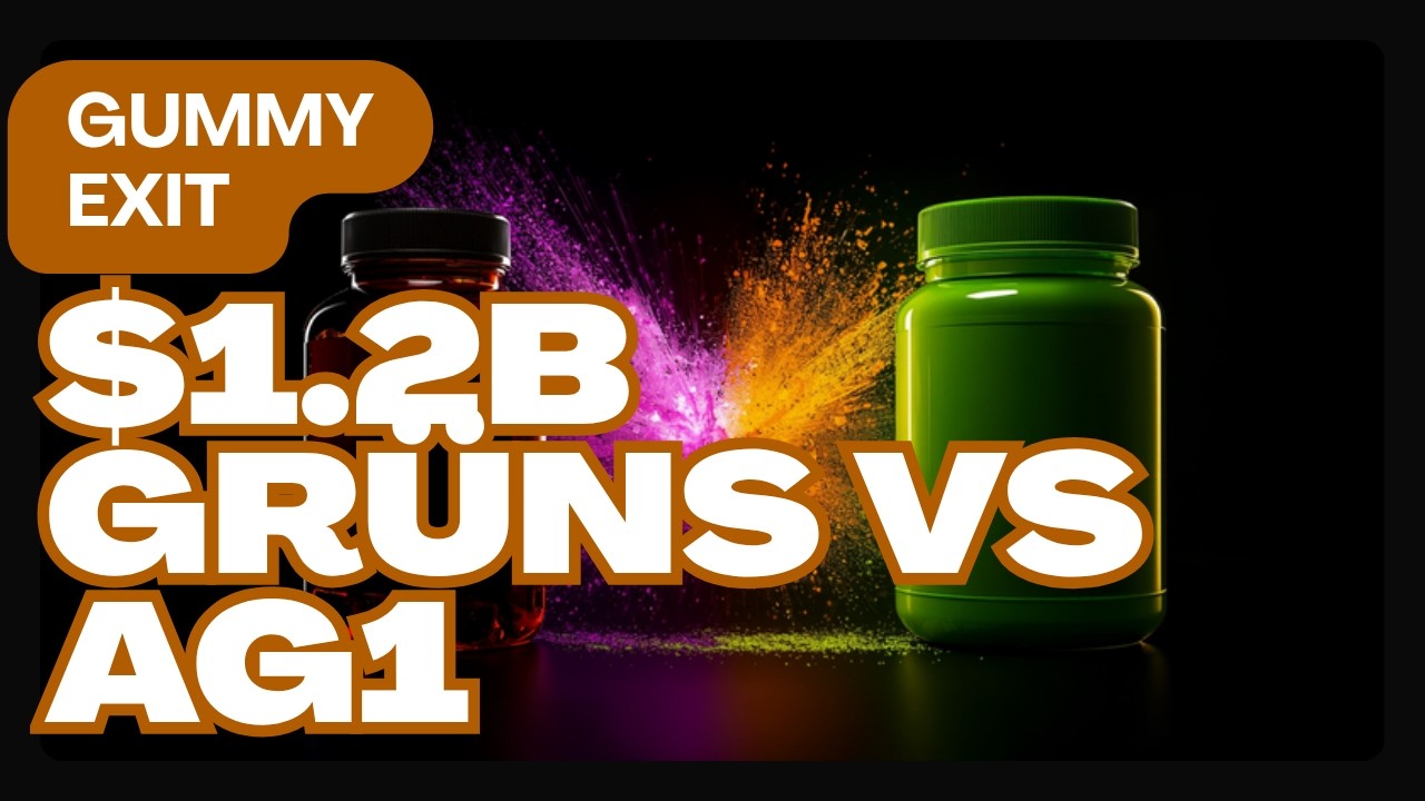
Two brand directions. Two billion-dollar outcomes.
The six concepts above are how we would position a product. This is how two real companies actually did it against the same incumbent, and why both of their very different directions worked. Preston walks through the funnels, the pricing, and the one lever each brand pulled.
Do you have to be in California to work with PELORA?
No. PELORA is based in Newport Beach, California, and works with product brands across the United States. Positioning, brand kits, ad creative, paid media, and lifecycle marketing are delivered the same way whether you are in Miami, Austin, or down the street: weekly calls, shared dashboards, and one team that owns both the creative and the ad account.
For product photography and video, most out-of-state clients ship product to our studio, which is how several of the concepts on this page would be produced for a real engagement. We travel when the scope justifies it. We keep one office and do not claim locations we are not in, and our Who We Serve page explains exactly how the national model works.
In their words
Founders, in their words.
Verified and public on Google. Click any name to read it in full.
Verified · Google
“It genuinely feels like working with someone who cares about where your business is going.”
“We hired Pelora Marketing to help us build our business from the ground up and it has been one of the best decisions we’ve made. Preston and his team designed our website, set up our automations, and built an organic growth strategy tailored specifically to us.
We always feel heard. Every question gets a real answer and nothing gets glossed over. It genuinely feels like working with someone who cares about where your business is going.
If you’re an Orange County business owner looking for a team that actually shows up and delivers, look up Pelora Marketing. We can’t recommend them enough!”
K
Keisha M. Simon
Local Guide · 11 reviews · 3 photos
Verified · Google
“I highly recommend Pelora Marketing.”
“I highly recommend Pelora Marketing. The owner is a good friend of mine, and I’ve seen firsthand how much creativity, strategy, and care he puts into helping businesses grow. Pelora Marketing brings a thoughtful approach to branding, digital marketing, and business visibility. What stands out most is the genuine effort to understand each client’s goals and create marketing that feels intentional, professional, and results-driven. If you’re a business owner looking for help with your marketing, brand presence, or overall growth strategy, Pelora Marketing is definitely worth connecting with. Great company, great service, and a team that truly cares.”
B
The Business Botanist
3 reviews
Verified · Google
“Communication was clear, they delivered exactly what was promised, and the results exceeded my expectations.”
“Pelora Marketing did a great job from start to finish. Communication was clear, they delivered exactly what was promised, and the results exceeded my expectations. Highly recommend them to anyone looking for reliable and professional marketing services.”
J
Jake Jennings
3 reviews
06 · Questions
Product brand positioning, answered straight.
What is product brand positioning?
Product brand positioning is the decision about who a product is for and what it stands against, expressed through every visible choice: the name treatment, the typography, the color palette, the packaging, the price, and who endorses it. The six concepts on this page are the same brand name executed six ways, and each one implies a completely different customer, ad strategy, and price point. That is the point: positioning is not a tagline, it is the sum of choices a buyer can see.
How do typography and color actually change who buys a product?
Typography and color are the fastest signal a buyer processes, faster than any headline. Condensed uppercase type in black and neon reads as performance and effort. A thin serif in gold on black glass reads as expensive before the price is visible. Chunky bubble letters in tangerine read as fun and young. Buyers self-select in under a second based on these cues, which is why the brand kit has to be chosen for the intended customer rather than the founder's personal taste.
Should my product brand sponsor athletes or use influencers?
It depends entirely on the positioning, and the honest answer for some brands is neither. A performance brand earns credibility from athletes who visibly use it. A clinical brand earns more from doctors and researchers than from any athlete. A Gen Z brand usually gets more from fifty micro-influencers than one celebrity. And an ultra premium brand can be actively damaged by sponsorship, because scarcity is its story. Match the endorsement type to the positioning, not to what competitors are doing.
What is the difference between a paid influencer and an equity partner?
A paid influencer is a media buy, and audiences increasingly discount it as one. An equity partner has ownership in the outcome, which reads as conviction. The buyer can usually tell the difference, so the same face delivers different credibility depending on the structure behind the post. For most early product brands, disclosed paid partnerships with genuinely matched creators outperform celebrity deals they cannot afford anyway.
What LTV to CAC ratio should a product brand target?
Our published guidance is a 3:1 lifetime value to customer acquisition cost minimum, with 4:1 or better as the target. Below 3:1, growth spends money faster than customers return it. The two levers are lowering CAC through better creative and targeting, and raising LTV through subscriptions, repeat purchase, and average order value. Most product brands have more room on the LTV side than they think.
How do subscriptions change product brand economics?
A subscription converts a one-time buyer into a recurring one, which raises lifetime value and makes a higher acquisition cost affordable. It works best for products consumed on a schedule, daily supplements, monthly replenishment, because the habit forms inside the first delivery cycle. A steep intro offer can be a retention mechanism in that model: the discount buys the trial, the habit makes the renewal decision before full price arrives.
How much should a product brand spend on ads?
Our published guidance is keyed to monthly ad budget. Under $3,000 a month is Google Search only. $3,000 to $7,500 adds Meta brand awareness video. $7,500 to $15,000 supports multiple campaigns across both. $15,000 and up is where YouTube and TikTok earn a place. Spreading a small budget across every channel at once is the most common way product brands waste money.
Can PELORA build the brand and run the ads, or only one?
Both, in one team, which is the point of hiring us. We design the positioning, the identity, and the packaging direction, produce the photography and video, build the landing pages, and run the paid media against our own creative. When the same team owns the brand direction and the ad account, the ads and the brand stay one story instead of drifting apart.
Does PELORA work with product brands outside California?
Yes, nationwide. PELORA is based in Newport Beach, California, and the work, positioning, creative production, paid media, lifecycle marketing, does not require us to be in your city. Most out-of-state product clients ship product to our studio for shoots, and we travel when the scope justifies it. We do not claim offices in cities we are not in.
Are the six product concepts on this page real brands?
No, and that is deliberate. All six are our own brand name, PELORA, designed as concept work to show range. We do not display client logos or invent case studies to decorate a portfolio. When we show real client work elsewhere on this site, it is labeled as real and named. When we show concept work, it is labeled as concept.
What does this cost?
Retainers run across nine published tiers from $3,500 a month at Launch to $50,000 at Elite, plus a one-time setup fee ($4,500 above Launch, $1,500 to $2,000 on Launch), with a three-month minimum and month to month after that with 30 days notice. Ad spend is billed to you directly by the platform and never marked up. Every engagement starts with a free Growth Check on a booked call.
Which of the six is your product?
Free Growth Check. We look at your positioning, your creative, your economics, and tell you what is actually costing you money. We will also tell you if you do not need an agency yet.